
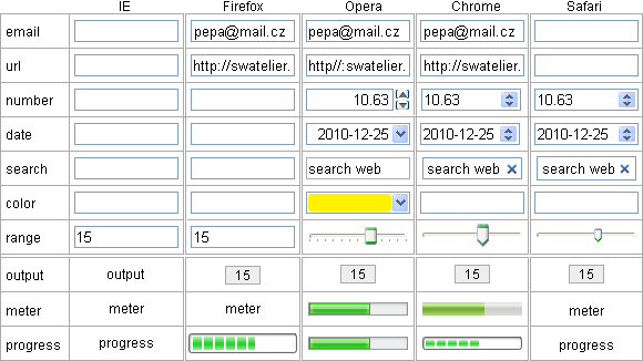
Form elements according to HTML5 specification
HTML 5 specification introduced some new form elements. Support of new elements in different browsers is listed below. In addition, you can see screenshots of new elements in different browsers. Description, attributes or validation method of new elements follows. If you want to test automatic, or built-in validation, run this page in Opera browser please. Opera has the best support of built-in validation. Chrome8 Safari5 do not perform validation. Validation is performed only after you click submit button. Live form elements are placed in the second column of table.
Browsers support
Screenshots of elements are from Windows XP and the intention is to compare the elements appearance in different browsers. Blank input element means that the browser treat the element as standard element <input type="text">. The only one style property used here is the width of input element, in order to obtain comparable screenshots. Only the latest final versions of browsers are listed here.
Description of the new form elements
Advantage of the new form elements is built-in, native validation of the element value. Native validation is performed even if javascript is turned off. To trigger naitive validation, attribute reqired in form element have to be specified.This could greatly simplify the form coding, because of the error messages are provided by browser, so no need to write client validation functions. Server validation have to be executed anyway.
Another advantage: form element can accept only characters allowed for that type. Eg. the element type of number does not accept letters. Mobile devices with touch screens should display on screen keyboard, containing only that characters allowed for a given element type.
<input type="email">
The correct email address have to contain just one at-sign and at least one dot. Valid email means only that it is written in syntactically correct format, rather than the address actually exists.
<input type="url">
Element is used for entering a web page address. When text is correct and do not begin with http://, native validation in Opera adds preliminary text http://. Again, only page address correct syntax is validated, it is not tested whether page address exists.
<input type="number" min="1" max="12" step="0.01">
As expected, the element number will be filled with integer or float number. Element may contain attributes min, max, step, defining the permissible range of the number and value of increment. Part of element are two small buttons (spinner), for setting desired value by help of mouse or by cursor keys on keyboard. Of course it is possible to write a numeric value directly from the keyboard. Evidenly numbers are submited as a text (string of digit characters), not as a binary value.
In Chrome8 you can type in only numbers, sign plus or minus and decimal point into this element, but the validation is not ideal. Opera allows to type in anything, but the native validation raises an error when not a number, out of range, or more decimal places than specified in attribute step occured.
Decimal number notation requires the point as decimal separator. In many countries decimal comma is used as decimal separator. There is no problem to make custom validation to allow both decimal point and comma in general textbox. But in number element only decimal dot can be used.
<input type="range" min="0" max="12" step="1">
For setting the range and resolution, element range uses the same attributes as element number. Internal numeric value of this element depends on the position of the slider. To adjust the slider, mouse or cursor keys can be used, without JavaScript enabled. Digital value of this element stays invisible, only position of the slider is adjusted.
Basically it is an analog like input element. To setup the value by slider is much faster than type in digits, but it is less accurate. It is suitable in applications, where absolute value is not important, but subjective feeling of feedback is relevant: volume, color etc.
<output onformchange="value=range.value">-</output>
When internal value of the element range has to be displayed, element output is the right sort. Binding to the source element of the form is denoted in the heading. With help of JavaScript can be used as an output of result of complex calculations. In the basic shape only value is visible, without frame and background, therefore several properties of style are used to improve visiblity. Up to now the element output works in Opera only with JavaScript enabled.
Date and time picker
There is a series of new elements to pick up the date and time: <input type="date">, <input type="month">, <input type="week">, <input type="time">, <input type="datetime">, <input type="datetime-local">. Type of element clearly describes what type of data should to be enterd. Required date format is according to ISO: yyyy-mm-dd. Currently in Europe is used format dd.mm.yyyy and in U.S. mm/dd/yyyy. Although ISO date format clear and understandable, its general acceptance is not so obvious.
When element is activated, Opera launches a dialog (vidget) to select a date. In vidget are visible weeks, which is often critical information. Chrome8 uses spiner to traverse through days. To set a remote date, such as birthdays, by spiner is lengthy and you have to override at least part of the date by the keyboard. Weekend information is missing in Chrome.
<input type="search">
Chrome and Safari displays a small cross icon inside the element which is used to clear the inserted text. Magnifying glass icon as a symbol for search was more natural. Cross (or x) icon was symbol for closing window. A bit half-cooked. Opera does not display any icon inside the element and thus the element is indistinguishable from the common type="text" element.
<input type="color">
After clicking on this element (yet the Opera only), a vidget with a choice of 20 basic colors appears. In this vidget you can select one of basic color, or type in the color code, or to choose another color (other dialog box) where you can select any color from the spectrum. Color code in Opera screennshot is "#fff200".
<input type="tel">
Because there is great variability in the formats of the telephone number, there is no fixed rule, and thus no native validation for this type of form element. This element is not listed in the table, even in screenshots. It is important for mobile devices, which offer a special digital keyboard on touch screen.
On an intranet, where almost every form contains a data type of date, time, integer or float numbers, new types of elements could provide a considerable simplification of the form design, especially when coding validation scripts. Unfortunately, the native validation of date and number do not take into account national format. In fact, the only useful type of number for the integers can be used as international.
There is a question: will web adopt national format of data, or nations will adopt web worldwide format of data, including printed, official, non web documents.
Form elements according to the HTML5 specification are under development and the looking for optimal functionality. Therefore, this theme will come back here. Let's just hope in happy end, not as file element, which looks like under development forever, namely in all browsers.
updated 2010-12-25